Monday, 28 February 2011

Interior Treehouse Modelling

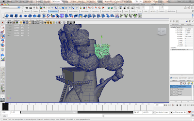
I began modelling the interior of the treehouse today using the method suggested by Mike Smith and Karen where I make each individual plank and build it up piece by piece. I used the original treehouse model I have as the base template and built on top of it as if I was tracing it almost, this allowed me to make sure that I recreated the shape and proportions more accurately and that the window and door were in the correct positions.


the shot above shows the progress after I had the bulk of the shape made. The main problem I had was making sure that the planks were the right size and that each plank was slightly different from the one next to it in terms of length, width and the way it is positioned. I made sure to leave little gaps in some areas of the walls between the planks and in the floor as there would be in real life. Karen wanted the walls to look like they tower over the characters in the camera shots so asked me to pull the tops of the walls inwards so that they lean over slightly helping to achieve a domineering and scary atmosphere.


I had to make sure that I built some of the exterior walkway and railing around the door area because one of the camera shots will be looking towards the door, so if the outside is missing it will look very wrong and could kill the animation.


I tried making the roof in the same manner as the rest of the treehouse, I didn't lay the planks straight side by side but had some of them slanted slightly so light can creep through the cracks and possible even water drops if we have time to figure that out.
  

When I finished the modelling I imported some of the props to test how they look in the layout and to give Karen a look at how the scene was coming along. She was happy with the ending result but was concerned with how rough the outside of the treehouse looked, however I explained that no camera shots would be used on the outside of the treehouse for this shot so it was ok for the long woodplanks at the corners to be there.

I've still got a lot of tweaking and refinement to do on the treehouse but I can happily say the last few days working on it were a success.

Wednesday, 23 February 2011

Progress Update

We spoke to our course leader Mike and received some feedback for the work we had done since our formative back before christmas. Luckily for us he seemed rather impressed by what we had to show him and confident in how our work has progressed since he last saw it which made us all feel very relieved and quite happy to know that we was on track. In terms of the work I had produced or was in the process of producing Mike made some interesting suggestions which we all felt eager to implement into out work. Where I had made the treehouse for the exterior shot and was going to alter it for the interior shots, Mike suggested that the interior treehouse be completely made separately with each individual wood plank pieced together like it would be in a proper construction, this is the exact same thing that Karen suggested earlier in the year but I was personally unsure about it considering the workload I had, but now we are all confident it is something that can be done and will look better than just having wooden plank textures on a plane flat wall, also there will now be cracks inbetween the planks so that will help create some interesting lighting effects for our scene.

So now I have another modelling task to complete before I can start the UV mapping and texturing, which I have to say i'm quite happy about as I enjoyed modelling the treehouse and tree as well as the fence and garden bench and would now ideally like to model as much as I can. This is also good as i have identified environment/prop modelling as one of my strengths and would like every opportunity to improve upon it and gain extra practice and experience; it is also the first time I've actually felt confident about a job role which I feel i could confidently work within in the industry one day, which is a plus because I really enjoy it.

So in conclusion, chat with Mike went smoothly, got some new ideas, and i'm ready to start working on them...i'm very confident it will turn out just as well as my previous modelling.

Saturday, 12 February 2011

Texturing Practice

As I haven't touched texturing or UV mapping since the 1st term when I was learning it for the Professional Skills unit, I thought it would be a good idea to go back and refresh myself on the process of what has to be done, I started by using the Toy Blocks scene which Karl had made.


I started by selecting only the faces of the letters and the edges of the block so that i could apply a completely new material to it, this way the blocks textures would be spread over two separate materials, this isn't a method I would usually like to use, but I thought I would experiment with it to see what practical benefits it may bring.


With the block separated by two materials I could easily apply colours to the areas I wanted with ease, i found this to be rather convenient and thought that if I only needed to change a small detail on an objects texture then it could be done in the hypershade nice and easy without having to go back and forth between maya and Photoshop, however this is not proper texturing technique and I would probably only use it if an object had different materials on it e.g. cloth with a plastic button, if that were the case I would have a Lambert for the cloth and then use a Blinn or Phong material to replicate the plastic.


An issue that could occur if this method was used on large scale would be the organisation of the hypershade; the hypershade can get very messy very quickly depending on how many objects are in a scene and how many different materials and textures there are as well. However the scene I have is very tidy because there is only one poly object with only two materials, both of which are Lamberts.


I applied a wood texture to the main body of the toy block and put a plane in to replicate the ground, I then applied a wooden plank stock image to it with as a bump map to represent the wooden floor of the tree house. I tried to add shadows to the scene as well but for some reason it kept on crashing my Maya, i'm not sure if the scene file had become corrupted but it would not let me render with shadows turned on so the image above is the best possible result that I can show for the time being.

Monday, 7 February 2011

Some Progress Renders

I have some test renders which I'm using to show the progress of my modelling. I used ambient occlusion to render as I feel it shows more tone and and definition to objects and is a good way to identify areas which may need improving.


The render above shows how the scene was looking in the last post that I did. The leaves on the tree still seem a little too tidy and limited in their use so I had to change that at a later stage. Note the bench in the bottom corner which I also modelled to help with props for the garden.


This new render shows an updated version of the tree, the leaves now come out further on each side making it look fuller and healthier whereas before it was a bit too thin. I particular like this render because you can see the large curve in the shape of the tree trunk which contrasts nicely with the straight edges of the treehouse, I feel I've personally achieved a lot so far in terms of my modelling skills as I've successfully combined a natural object with a man made structure without it looking odd and not working properly, so I have to say i'm quite proud as I wasn't sure how my modelling would turn out as I hadn't done it properly before.


This close up is so the detail can be seen a bit more clearly, especially in terms of the leaves and how they are positioned. My next task is to start UV mapping and texturing my models as well as those created by Karl and the characters in progress by Karen. I also need to make a copy of this scene file and adjust it so that its just the treehouse and the tree in the corner with no leaves, ladder or exterior items, this is so we can have a separate scene file for the interior shots. One main thing that I think I will need to change will be the size of the treehouse so we can have more space inside for the characters and props as I feel it may be a little bit too small as it is, however we will jsut have to wait and see until we put the props and characters in.

Tuesday, 1 February 2011

Leaves....oh dear

One of the biggest worries I've had from the start has been about how to make leaves for the tree, initially I thought we would be using a solid block shape which would be sculpted and molded to look like it has definition and leaves on it, but I recently purchased a Maya book called 'Maya Studio Projects: Game Environments and Props' which has some excellent tutorials on how to create Maya assets for the game industry; this book has a tutorial about how to create leaves for game environments which I think will be good to apply to the tree.


The tutorial explains about the use of a tool called the 'Sculpt Polygon Tool' which allows you to place vertices and draw whatever shape you need, and once you join the final vertices the shape will be created as a flat plane. This method should work well for creating the leaves as they only need to be flat shapes with a texture map applied to them.


In the shot above I have already made a leaf and duplicated it, I was mainly trying to get the shape and size right for it so I could start duplicating it more and making the bushiness of the clumps of leaves.


This image was a test to show Karen and Karl, I made a simple curved plane shape by arranging the leaves and then duplicated it multiple times, I then arranged the duplicated shapes so that I could make a rough mock-up of how the the tree could look in terms of how far the leaves come out and how tall they go. Feedback from my team mates was good and I was given the go-ahead from Karen to start arranging the leaves properly.


By looking at the shapes of the leaves on trees and seeing how they are bushy and made up, I thought it would be good to make separate bundles of leaves so that I could place them all together like a big puzzle and build up the shape of the tree that way. The image above shows the main shapes I made which would make up the core of the trees leaves.


I started to place the leaves shapes around the tree to build out the shape of it, however I made sure not to do it around the back because it would increase the scenes poly count dramatically and it would not be seen in the shot.


The difficult thing is to make it look believable and to not put too many similar shapes next to each other,  keeping it random and offset helps make the leaves look more organic and natural.


This is the almost finished scene, the main shape of the leaves is there but it needs to be pushed out wider on all sides to give it more mass and volume, at it's current stage it looks a little odd as it should be a lot more bushier.