Saturday, 28 May 2011

Crayon Texturing

I'm slowly running out of time and I don't think I'm going to be able to finish all of my work before the deadline, plus with all the problems that we've been having with our characters and Karens access to working hardware it doesn't look like we will even be able to get a partially finished film. I based the textures for the crayons off of some cheap crayons I saw in the pound shop and made them to a basic looking level as they will most likely not even be seen in the film anyway.


I made approximately six different coloured versions and applied them to the geometry as seen below, thankfully these only took a few hours to complete which is the best thing about props which are not in shot as they don't require as much effort as the major important ones. 

Thursday, 26 May 2011

Rigging a Tree...Oh boy....

For the opening shot of our film there is wind picking up and rain as the storm gets closer and closer to the treehouse, to make the opening shot look that bit more believable we will need to have movement in the tree and the leaves. Even though I'm completely overloaded with work at the moment it's been left to me to rig the tree and animate it. So not only do I have to learn how to rig in one day, I also have to apply it to the tree and then animate it all myself.....great....
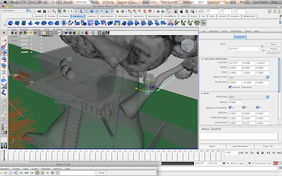

In terms of rigging I had no idea where to start, I searched for the most basic tutorials I could but even they were too complex for me to fully grasp so in the end I was doing a mix match of different tutorials picking out the parts that worked for me. Unfortunately we are too late in the term to ask for someone else to this for us as everyone is too busy on their own films. I started the rig by placing joints along the branches of the tree, for the leaves I had to imagine where there would be branches on the tree spread out so I had to place the joints accordingly, I also used images of trees without leaves to plan out where to put the joints. 
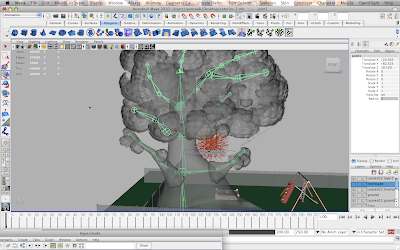

Once I finished placing the joints I had to make sure that the tree was prepared properly, I turned it into a 'Soft Body' so that once I attached the rig joints to it the tree would bend and move as I moved the joints. At this stage it was causing my Maya to start lagging and slowing down because of the large amount of faces for the leaves being moved at the same time, this has made working on this part of the project extremely long and frustrating as every little movement or click I do lags the software.


This is a playblast of the first animation test I done on part of the leaves, generally the movement looks pretty good and the timing is quite good as well, but I've noticed that the leaves are stretching in some areas which is going to look very wrong in a rendered shot. To be honest I'm not even sure if this is the best way to animate the tree but nobody seems to know how to do it any other way and from what I found online, a rig is the best way to do it.


This playblast shows the stretching of the leaves a lot more clearly as I exaggerated the movements in the animation to make it look like the wind is a lot more fiercer. To be honest, if I were to fix the stretching, the only way to do it would be to animate each and every individual joint of the tree rig so it flows smoothly, however given the time constraints I have and the lagging of Maya it will not be possible, as it is, I feel that the rig has failed and that another method may be needed to animate the leaves. I considered the use of dynamics and tried it out but I kept having error messages because the tree and leaves are too complex in terms of geometry for the Dynamic fields to apply to. I tried changing the tree to an 'active rigid body' so that I could apply a turbulence field to simulate the wind blowing into it but again I had similar error messages for the same problem.

I tried a ditch-last effort again with the tree rig but found it impossible to use, maybe if I was more experienced I could've made a more complient and easier to use rig set-up for the tree, but with my knowledge I did the best that I could and consequently failed due to pressing time constraints and software issues, it doesn't help that Karen hasn't been able to use her laptop for a while now either so I feel that the group has fallen behind, I wish Karl would be more willing to help out and assist with problems as well but he's only interested in doing his own tasks leaving the problems to me and Karen to sort out.

Monday, 23 May 2011

Bouncy Ball Texture

The ball was easy enough to UV map, I tried using Spherical Mapping which I thought would work well on an object that is a sphere, but it was throwing the UV's all over the place so in the end I had to do a Planar Projection which made it a challenge to accurately unfold the UV's.


I used a phong material to apply the texture to, this helps it have a more rubbery plastic feel to it which is common in childrens balls.


When it came to the texturing I had to do the stars different sizes with the smallest in the middle and the biggest on the outside because of the way the UV's had to be made. I kept the style of the ball the same as the other objects I have textured, making it look worn and used with scratches and scuff marks spread about.

Saturday, 21 May 2011

Rocking Horse UV Mapping and Texturing

I'm not entirely sure why but I've been quite scared about UV mapping the rocking horse that Karen made, I think it may be because of the horse body and it's shape which I'm worried may cause some problems. 


I started the UV mapping by using the same process I used on the character Pandy where I separate different parts of the object by selecting the faces and using the 'extract' tool. This made it easier to break the model down into more manageable parts for when I was doing the Planar Projections, the object itself was separated into the horse, the seat, the handles and the base.


The image above shows when I first tested the textures I made in photoshop, I usually find that once I apply a texture to the object that there will be a problem that needs to be changed in photoshop so I have to keep going back and forth, however I didn't have to do that this time. I used a similar process to the drawers where I identified areas of the object where there would be damage to the wood such as dents, chipped paint and dirt to create a texture which makes the object look like it actually has been used and is  in a slowly deteriorating condition.


The finished texture for the rocking horse ready to be placed into the scene.

Wednesday, 18 May 2011

Wooden Drawers Texturing - Finished

Here are some renders showing the finished textures on the drawers. 


The render above shows an angle identical to one of the camera shots in the animation, the drawers will be seen quite closeup in the shot so I had to make sure that there was enough detail in the side to make it look visually interesting. I made sure to include plenty of scuff marks, dents and dirty patches to show that it is a worn down object and in bad condition.


This standard frontal view is just to show the general look of the textures, luckily you can't even tell that I used the same textures on all the small drawers and then done the same thing with the middle drawers as well. It was difficult placing the damage marks on the furniture in a believable way, I had to make sure that the edges had the most damage, especially the ones near the floor as they would receive the most surface contact.


The top of the drawers have a collection of Summers crayons on there so I added lots of coloured marks to show where she has marked the wood with crayons and possibly other materials such as pens and even paint.


I wanted to add a more personal element from the characters perspective into the scene so I made it as though their names have been carved into the wood to show their relationship. I feel that having little details like the one I have included help make textured objects feel more real and interesting, I could've just have easily just slapped on a basic wood texture and left it as it is, but having the extra details spread about in the texture make it more visually appealing.

Sunday, 15 May 2011

Wooden Drawers Texturing

The next task on my list is to texture the props inside of the treehouse, a lot of the props were UV mapped by Dean Pankhurst who agreed to help us out a bit with our workload that was piling up. Dean made the UV's for the drawers which in themselves are a complex object to UV map if unfamiliar with the process.


The UV's were layed out very well and were easy for me to understand and work with without any problems. I started by getting the textures for the main base and structure of the drawers finished first. I wanted the drawers to look old and rough, as if they had been thrown out or discarded by a family that no longer need them, so they were given to Summer to go in her treehouse. To this I coloured the edges, especially around the bottom of the drawers to look like they have been scratched and damaged by being dragged around or had other objects banged into them, so the overall look and feel of the drawers is damaged but still useable.


This is a screenshot of me starting work on the drawers in photoshop, I initially wanted to make each draw a separate texture, but due to time constraints I've had to keep the same texture on the small drawers, the same with the medium sized ones as well.


The image above shows the small set of drawers fully textured, each drawer having the same texture as the one next to it, this isn't something I particularly want to have so if I get time once everything else is finished I will come back and create some new textures.


The drawers are slowly coming together now, I've started adding more details and little marks to add character and give a sense of use and history with the object, rather than it just being a boring set of drawers in the corner.

Wednesday, 11 May 2011

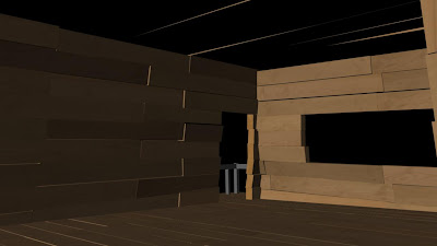
Interior Treehouse Texturing

The interior treehouse didn't take too long to finish, I showed Karen how to UV map so that she could help me out and lighten my workload a bit so she UV mapped all of the wooden planks in the treehouse for me. All I had to do was texture them. As there is over 100 wooden planks making up the house it would be impractical to make individual textures for each of them, so I made four different textures and when I assigned them to the wooden planks I manually altered the UV's and positioned them differently so textures would be flipped, rotated and look like completely different textures for each plank. Below are the four textures for the planks that I made. Each one using photographs taken from one of the fences in my garden which has been the source for a lot of my materials.


Plank Texture 01


Plank Texture 02


Plank Texture 03


Plank Texture 04


Getting the textures applied to each plank was a long and tedious process which took around a week for me to finally complete, the hardest part was to make sure that I didn't put the same texture next to itself and to not repeat any patterns, I managed to do it all without any problems and the results are what we were hoping them to be.


For the tree I played around with a bump map for it, because this is a closed in and closeup environment I thought it would work well to help bring out the detail of the tree bark, the image above shows the first test that I did.

Karen felt that that bump map in the first image was too strong and that the settings were too high, so I went back and altered it so that it was a little softer and smoother looking, now that I changed it I can see how much better it looks and notice that it matches everything else a lot more. With the environment now finished I can start working on the props for the treehouse.

Wednesday, 4 May 2011

Finished Textures for Exterior Shot

I wanted to show some renders of the finished textures that I have done for my groups work on the exterior shot, this is so you can see each separate asset on it's own as well as how it all looks when they're all brought together.


This is the tree by itself, I turned the treehouse off on a display layer to hide it for this shot so you can just focus on the tree and nothing else. The tree still retains the bold and fluid shape that we wanted at the start of production to match Karens visual idea, it also still has the bold colours that we wanted, but now the textures are slightly more detailed and look stylised yet realistic at the same time, effectively creating our own unique visual style for ourselves.


I wanted a closeup on the leaves to show how they look in a bunch when next to the treebark, I discussed with Karen whether we should apply a bump map to the tree bark to make it look more rough and bumpy, but we came to the conclusion that it would not be necessary as the opening shot is so quick and dark that it wouldn't make much, if any, difference, also the details of the bark are sharp enough to be shown in the texture map by itself so we decided to leave it as it is.


Although the underside of the treehouse will not be seen in the film, I wanted to show it anyway from this angle just to show more of the textures that wont be seen in the end, I'm proud of the way it's looking and wanted to at least show some of the hard work that I put into the textures.


This is a render of the finished tree and treehouse for the exterior opening shot at the beginning of our film. You can see a lot of holes and gaps inbetween the leaves revealing the white background, however this will not be a problem in the film because we will have a dark background which will hide them.


This is a closer look at the treehouse showing more of the detail in the modelling and textures. It took a long time to finish the textures but seeing the results sitting in front of me makes me realise that the hard work and stressful times was worth every second. Now that the exterior treehouse is finished I need to begin on the interior now, I have to make sure that I keep the colour palette consistent with the tree bark and treehouse planks so the shots flow together smoothly without there being major colour tone jumps which would throw off the audience.

Sunday, 1 May 2011

Exterior UV Mapping and Texturing - Treehouse

I started working on the treehouse directly by creating the UV's and making the textures. Time is gradually running out for us and the textures need to be finished as soon as possible, I also have to texture the interior of the treehouse as well as the props so I've still got a lot on my plate. To help save time with the UV mapping I used a method which I never like to use, 'Automatic Mapping', which automatically maps the UV's for you and you don't have to unfold them, this usually breaks up the model into lots of separate UV's and is generally pretty messy, however I'm short on time so I have no choice but to give it a go.


As you can see from the texture map above, the UV's were thrown all over the place and it looks quite messy and unorganised, however it saved a lot of time for me and the main parts of the geometry that will be seen the most in our film were layed out perfectly in the UV Texture Editor.


The above screenshot was a progress shot I took to show the rest of the team so they could see the progress that I'm making on the texturing. It was important to keep up to date progress sessions as a team to try to keep us on track and this is an example of the type of thing that I have shown to present my work to the group.


The geometry for the treehouse is broken into separate parts, there is the treehouse, the roof, the railing, the ladder and the support planks, apart from the treehouse everything else was UV mapped by myself using the more proper and accurate methods of creating projections and unfolding them in the texture editor. The texture map above is for the ladder, I made it so that the steps would look worn and dirty due to continuous use of shoes and boots when Summer and any other kids have climbed up and down it, I also had to apply this worn/weathered effect to the rest of the textures to make sure it was consistent and generally accurate for the environment. The visual style for our film has slowly changed over the course of the production and the environments have gone from being simple with basic colour to simple with detailed textures. This hasn't been a decision made on a whim but a gradual process which has been more suited to our work and in my opinion looks much more suitable for our film.


This is the roof of the treehouse texture, when I originally made it and applied it to the model I noticed that something didn't look right, but I couldn't put my finger on what it was; it wasn't until I looked out of my bedroom window into the garden that I realised what was missing. The shed in my garden sits underneath a tree and the roof is quite dirty with twigs, dead leaves and other natural mess and dirt; this is what needed to be added to the roof to make it look more natural, otherwise it just looks strangely clean and out of place in the scene.


This is the updated texture for the roof, I added more murky and dirt based tones to the wood to give the impression of moss and staining from bad weather as well as dirt which has come from the tree and leaves above.