I decided to start UV mapping the characters first as they will be the hardest for me and require the most attention. I started with Pandy as his shape and design is a lot simpler than Summers so it will be best I start off small and then work my way up.
I started the UV mapping by preparing the the geometry by splitting it into separate parts. I did this by using the 'pain select tool' and identify key areas which could break the geometry up into manageable UV sets. For example I selected all of the faces of the hand and then went to 'mesh' 'extract' so that each part of the body is separate but still joined together.
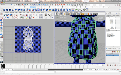
With each part of the body separated I could easily turn the other parts of the body on or off at will to help make the workspace easier to work in. I started by making a 'Planar Projection' of the torso which creates a flat 2D projection of the body's geometry in the UV Texture Editor. The only problem is that the body's UV's have not been unfolded yet which has to be done manually.
To unfold the UV's on the body I had to figure out the best way that the body could unwrap, I had to do this mentally and try to do it in my head which was quite difficult. Doing this I then have to decide the best places where to cut the UV edges which will determine how the body UV's will unfold in the Texture Editor, this can be seen in the image above where I have already unfolded the body. The UV's have layed out quite nicely and evenly which is great news at this stage. I applied a checker material to the geometry as well so that I can see how the UVs layout and if there are any problems, I also changed the colour from black and white to black and blue so that the UV edges are clearer to see as they are displayed in white.
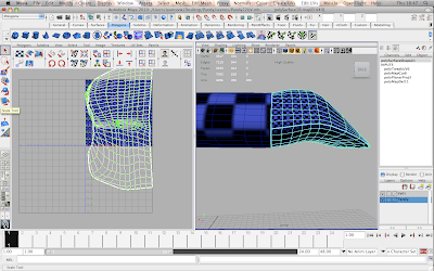
Everytime I took a UV snapshot I had to resize it in the Texture Editor, I also had to make sure that the squares of the checker pattern on the model were all of equal size otherwise I would have textures with mixed quality where some areas would look higher quality and sharper than other areas.
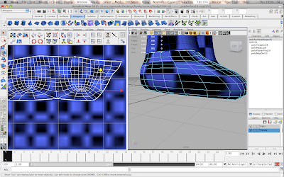
A problem that I hadn't anticipated by using the UV mapping method I have is that for Pandy, I separated his body into manageable parts to work with, but I had to match up the UVs to make sure that they would align properly. The image above you can see where the checker on the foot isn't properly lined up with the checker on the leg which may cause the textures to look weird and out of line with each other. It took some time but I figured out how to align the UV points manually in the Texture Editor which has given me a greater amount of control over my work. To fix it all I had to do was select the UV vertices in the Texture Editor and move them with the move tool which is incredibly easy to do.
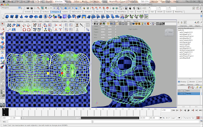
Creating the UVs for the head was the hardest challenge for this model, the reason for this is because the face will be the most featured part of Pandy in the animation so the textures need to look perfect and apply to the model with no problems at all, otherwise they will show in the animation and it will discredit my own abilities as well as the hard work of the rest of the group which wouldn't be cool. I cut the UV edges along the top of the head from one ear to the other and down the side of the head, I was unsure of how this would work but it turned out pretty well. The only thing is I wont know how well the UV mapping has been done until a start making the textures and applying them to the model.
Above shows all of the UV's for each part of the body layed out and resized in the texture editor, i'm a little worried about the stretched checker on the body but if it does cause a problem then I can adjust the UV's and try again.
In photoshop I mocked up a texture quickly as I was eager to see how it worked and looked on Pandy, I grabbed a sack texture off of google images to save my time so I don't have to source my own texture images and worked into it on photoshop to add my own style to it. I then applied it to the model in Maya, but I had to tweak a few things before it would be ready.
I wanted to set up a bump map for the character texture so that the texture would not appear flat on Pandy but have some depth and believability to it. The hypershade is where I set up the bump map and applied it to the lambert material which was the source of my texture file, this can be seen above.
The render is the first test of the texture being applied to Pandy, the only detail was on the body whereas the rest of the character has just flat colours to represent how it would basically look.
The render above is a more refined one I did over the course of a couple of days, the textures are made up of painting in photoshop and using photos of material I took on my camera to represent the bumpiness of the sack/knitted material.
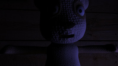
I experimented with some lights and their colour to see how the textures would look with the lighting that we are planning to use in the film. I felt it was important for me to see how the textures would look in the scene set up to be as close as possible to our final result to make sure that the way it looks is how we want it so I can make any changes now, rather than it being 2-3 weeks before deadline and having Karen wanting changes to be made because it doesn't look right.
I was taking renders from as many possible angles, paying primary focus to the front views and close-ups that would be seen in the animation. Karen also said that his eyes look too flat and washed out and wondered if I could make it have some reflectivity so it glints when the light shines on it. I went away and changed this by taking a separate UV snapshot of the eyes and making a new eye texture, I applied a blinn material to the eyes and attached the new eye texture to that to give the eyes the effect that Karen had requested.
And here's one more render showing more clearly the stage that I have come to with the character textures, you can also see the updated eyes with the glint on them.





No comments:
Post a Comment