Tuesday, 21 December 2010
Christmas Time....BOO YA!!!
So after our formative we had a lot to think about and quite a few bits to change, it doesn't help that christmas is only a few days away and none of us are in a working mood so things are going to be tough for a while. We've all had our own ideas of how we could change the ending of the animation but none of them are hitting the mark, I think it's because we're under pressure as well to start working on production that we're starting to panic a bit and finding it hard to come up with substantial ideas. Maybe having a bit of a rest and recharging ourselves with chocolate, drink and roast dinner will help us get back to our former glory so we can figure out this story and continue working properly. Luckily Karl is still safe with prop modelling and Karen can start the character modelling whenever she is ready so we're not at a complete loss....See you in the new year =)
Saturday, 18 December 2010
Formative Assessment - Presentation
So we had our formative assessment and presented our idea and the work we've done so far to the rest of the class and tutors. Overall it didn't go as well as we had initially hoped for. Although we didn't get feedback from the students themselves, our tutors gave us their opinions and identified areas for us to work on or change to help improve our work. The first thing which was questioned was the backstory of our main character Summer, Mike seemed very specific about our characters having a deep and detailed history and purpose to give them more weight and believability, the only problem I could see with that is that our animation is just under a minute long, we have just enough time to tell our short story let alone trying to include more detailed information about Summer, if we pushed it any longer we wont be able to handle it because the workload would be too large for all three of us.
The second thing was that Mike and Dave Bull seemed a bit confused about our story and found it difficult to understand our simple concept of Summer having a nightmare and suddenly waking up from it. This was quite frustrating for us as a team as we tried explaining it to them step by step but they couldn't get their heads around it, so we couldn't help but think other people who saw it felt the same; so now we have to go back and rework the script, storyboards and animatic and completely change half of the story so that it has nothing to do with Summer having a nightmare (because apparently that is just too difficult to understand) and have a completely different ending. This is annoying because we feel we have been set back a few steps as we have to brainstorm new ideas and try to figure out a new way to end the film, this has also slightly delayed me from starting my modelling because I have to go back and redraw the storyboards and re-edit the animatic with new sound, if we were a bigger group I wouldn't mind but as it is I feel that our time is too precious to be wasted on trying to make the "perfect" story when all we want to do is showcase our abilities and skills at the end of the year with a nice simple animated film.
Thirdly some of the concept work between all 3 of us was hit a bit hard and considered too weak and undeveloped which was a bit of a slap in the face for us considering we're not the greatest when it comes to that sort of thing either. Overall we all felt a little disheartened by the formative, we had issues in our work pointed out and highlighted but then given no ideas or thoughts on how to improve them, so to us it seemed like we were told "thats bad, so is that, that could be better, that doesn't make sense....see you next week!!", we didn't really get any constructive criticism or views to help us which has left us feeling a little stranded and lost.
Well for now, we've got to just crack on with it and change the ending of the story so that it isn't Summer having a nightmare.....I wonder what we'll end up with.....?....
Sunday, 12 December 2010
Colour
The following piece of concept is for the interior of the treehouse.
 For this piece I was mainly experimenting with different tones of brown that you find in wood as well as trying to replicate the grainy look in the planks as well. It was also important to try to identify the main areas of shadow and where the majority of light will be in the scene to assist us when it comes to lighting at a later stage. One thing that i'm not too happy about is the size of the wooden planks used to build the treehouse, I think I've drawn them a bit too small and should change them so that they are longer in size, because at the moment it's starting to look a bit too much like brickwork the way in which they are all tiled together and we definitely don't want the audience to think that when they watch our film.

Friday, 10 December 2010
Animatic
I cut together the drawn panels I used for the storyboard to create a simple animatic to show the pacing of our animation, as well as the timing of sound effects and certain shots. The timing is important for our film because a lot of the character emotions come from them reacting to the lightning and thunder from the storm outside. I used stock sound effects which are free to download to give a rough idea of how the sound will be until we can get a sound student to work with us and do it properly.
The timing and pacing will need to be slightly tweaked and reworked before we start animating or getting the sound sorted, but overall we feel that the animatic works really well and clearly shows our ideas and design from start to finish.
The timing and pacing will need to be slightly tweaked and reworked before we start animating or getting the sound sorted, but overall we feel that the animatic works really well and clearly shows our ideas and design from start to finish.
Sunday, 5 December 2010
Interior Concept
Here is a concept piece that I have been working on for the last day, it is for inside the treehouse and shows the main character Summer pinning up another one of her drawings onto the wall.
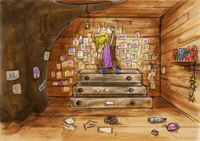


I talked with the rest of the team and they agreed with me that having the treehouse looking slightly messy and unorganised will be key to making it a believable environment. The only problem with this image is that it is themed as a daytime shot so I altered it and made a night time one as well which is more representative of the film we're making. The altered image is shown below.

In terms of colour Karen wanted to have a mixture of blue and purple tones so I have tried to incorporate that into the concept piece.
Tuesday, 30 November 2010
Educating Myself
Whilst drawing sketches and pieces of concept for the treehouse I have also been researching into how wooden structures are constructed, the reason for this is because I want to make sure that everything looks believable, even down to the small details. To help me with this i've had plenty of reference images of treehouses by my side to help keep things accurate and grounded in re
ality which is important for us, even though we're doing a stylised film it's important to keep realistic elements in the film so things seem that bit more real.


ality which is important for us, even though we're doing a stylised film it's important to keep realistic elements in the film so things seem that bit more real.

On this image I particularly like the wooden support planks which help support the house in the tree, I would love to incorporate it into the modelling to give it a bit more life and character.
I have also been reading through a book which I luckily found and decided to buy when the book stall came to the college, the book is called 'The New Wood House' which documents a very wide variety of wooden structures from all over the world, these range from eco homes, treehouses to mountain lodges and forest cabins. I found the book to be very helpful and also a little bit too inspiring as it has put many crazy ideas and designs in my head which are far too complex and elaborate for our project.

Friday, 26 November 2010
Further Concept
We have all been working really hard as we have to present our work in an end of term formative assessment presentation in front of our class and tutors, for this we have to make sure that we have a script, storyboard, concept art and plenty of other visual material to communicate our ideas to everyone else. We're also aiming to have started modelling and possibly have some render tests to show how we want our film to look. However this isn't until December in the week that we finish for christmas break. For now i've been trying to develop how the interior of the treehouse could possibly look. Below are some of my initial rough sketches I did in photoshop.

Karens original treehouse concept has lots of drawings covering the back wall, so this is something I want to continue throughout all of the designs as the wall is almost like a collage of all of Summers drawings. I have included the tree trunk taking up part of the corner of the room so it looks like the treehouse was built around it.


I played around with black and white as well as colour for the two above images. This is where I realised that there is going to be a lot of different wooden objects in the animation and each one has to have it's own unique look and feel, if they all shared the same wood type for their texture it would look very boring so I have to make sure I use a mixture of wood types, colours and different grains as well as a mix in the quality of the wood, whether it is fine and clean or dirty and old and if so what type goes on what object, there is still so much to figure out and plan.

The image above is from the perspective of where the character Pandy will be standing in one of the shots, his shadow will be cast along the floor into the corner where the tree and the drawers are as that will be where Summer is hiding in one of the shots.

One of the problems that we may encounter at a later stage in production is to do with lighting as there will be light coming in from the window and the door, this could cause problems when we try to create silhouettes and shadows stretching along the floor as there will be conflicting light sources. The image above however shows where there would generally be the most shadow and light in the treehouse if we were to go with the general layout that has been shown here. Karen and Karl feel pretty optimistic about what I've showed them so far and have requested a more detailed floor plan and layout for the treehouse which I plan to get to them as soon as possible. This way karl will be able to plan more on the sorts of props that he needs to model and where they can be placed in the space that is given to him.
Monday, 22 November 2010
Tree and Treehouse Development
I went away after we talked about the tree shapes and designs to try to figure out some more ideas which may be a lot more practical for us. The thing that I have to keep in mind is that the tree and the treehouse are only going to be seen in the opening shot for approximately 5 seconds, so I need to make sure that I dont focus too much time on this one design as I need to start conceptualizing the interior of the treehouse as well so I can start modelling it all as soon as possible. Below are some more coloured sketches which show more detail in terms of the tree and and the possible exterior design of the treehouse itself.


I wanted to give the tree a really curvey and organic look to help emphasise the natural element in the film, I felt this would be important because the whole animation excluding the short establishing shot takes place inside the treehouse which is filled primarily with sharp straight edges everywhere because of the woodplanks and most of the props; so for the first 5 seconds I want to push the organic feeling of the tree to it's absolute max to help make sure that it doesn't look like a boring straight standing tree with no life or character to it. The actual treehouse in this image has quite a refined ornate design which gives it a more girly look to the design to show that it isn't just a rough, boys-only treehouse, but almost like a friendly home/playhouse for the girl to spend her time in. Also note how the tree trunk is broken through the treehouse, this is a feature that we have all agreed that we want to include in the design, this is so that the feature of the tree is present throughout the whole animation rather than being in it for just a few seconds and then forgotten.

You can also see the shape of the treehouse is very warped and curved, this is an idea that we discussed so that the architecture almost matches the extreme exaggeration of the tree, however the curves of the treehouse in these images are a little too much and as a group it was decided that it should be toned down a little bit so that it's not too "in your face".

Access to the treehouse is important, there has to be a way for the character to enter the location, even if we don't see her actually do it, the reason for this is to add credibility and accuracy to the scene. I've tried a rope ladder in these images but I later suggested earlier today that a sturdy wooden ladder might be more appropriate and show a better sense of safety for the girl Summer as she is only a little girl and should be in a safe environment; this means that a railing of some sort needs to be added around the treehouse so that there is no risk of falling off.
Thursday, 18 November 2010
Style and Concept
Karen has a very particular visual style that she wants to achieve with this film, and at the moment I'm not sure whether it's going to be easy or difficult. I think in terms of modelling it will be a challenge because everything needs to stay consistent with the design otherwise the audience will see that certain things look different from each other. However the texturing should be a lot easier and faster on my end as the objects and characters will require a lot less detail because of the stylised look we're now aiming for. Our main reference for the style is the game 'Fairytale Fights' by Playlogic Game Factory.
 From the image above you can see that the style is very simplistic with bold flat colours, whereas the environment in the background has an almost pastel/watercolour look to it which I feel I will easily be able to replicate due to my background with fine art which involved the use of a lot of mixed materials for painting. Another thing to take into consideration is the type of shapes and how they are used in the environments and on the characters, for example, a lot of proportions are exaggerated in size such as the eyes and head, whereas the trees in the environment will be one block shape rather than have lots of different branches and hundreds of leaves on them.
As the environment concept artist for the group I've been thinking about the possible shape for the tree which is a lot harder than I initially thought, this is because the tree has to look like it is strong enough to hold the weight of the treehouse but also retain the visual style that we are trying to achieve, to do this I have had to experiment with the shape of the treehouse as well as the tree to make sure that they can fit together properly without looking odd.
 The sketches above were for us as a group to help identify the style of tree that we wanted. We found out a lot about what twe wanted from these sketches, firstly we realised that the treehouse couldn't be too high off the ground, so the tree had to be a medium height but thick and strong enough to support the treehouse; secondly I realised that the shape of the tree that is shown is too highly influenced by the shapes of the trees from Fairytale Fights and in reality wouldn't be able to hold a treehouse due to the incorrect branch structuring. After some quick research I found that treehouses are usually built in mature grown trees which are sturdy and strong, also they must have a branch structure where the branches grow outwards to the side from the centre of the tree so that wooden planks can be layed down on them for the foundation.

As the environment concept artist for the group I've been thinking about the possible shape for the tree which is a lot harder than I initially thought, this is because the tree has to look like it is strong enough to hold the weight of the treehouse but also retain the visual style that we are trying to achieve, to do this I have had to experiment with the shape of the treehouse as well as the tree to make sure that they can fit together properly without looking odd.

Sunday, 14 November 2010
Storyboarding
As I was writing up the script and going through it with karen, I was also thumbnailing some of the shots to help show the type of camera shots that we could use in the animation. I used a lot of these thumbnails as the basis for some of the shots in the storyboard which is shown below.
 From the storyboard we can now see that our animation will be broken down into 29 different shots, a lot of them are closeups on the characters faces so as the texture artist I have to make sure that the textures are working correctly and look detailed enough for the camera. From this we can also see what props in the environment will be in shot so we can prioritize what needs to be done first and in higher quality than less important objects. It also tells me which objects need the highest quality textures on them and which ones can get away with lower resolution ones due to camera shots, distance from the camera or even the lighting/darkness within our scenes.

Wednesday, 10 November 2010
The Script..
I worked closely with Karen today so that we could pin down the story and get a finished script so that I could go away and do our storyboards. Because we are using Karens characters as well as the story to some extent, it's important that she feels happy with the story and the way in which the characters interact with each other and the environment to help keep everything grounded in Karens original vision. The main challenge we faced was figuring out how many shots was needed to tell our story, figuring out what was important and what could be discarded was difficult as we both had certain ideas that we wanted to include but in the end had to sacrifice due to the complexity of them in our scene as well as the time limit of 30-60 seconds. We managed to get our first draft of the script finished which turned out pretty solid and flows very well in my opinion, it's definitely a good starting point for us and I can now start the storyboards and animatic which will give us a much better Idea of how it all flows together while in motion. Below is the first draft of our script:
SCRIPT
EXTERIOR TREEHOUSE. NIGHT TIME
Long Shot establishing the scene, shows a tree and a treehouse which is illuminated when lightning flashes.
Close-Up shot of the treehouse, outside window looking in. A small girl is sitting inside on the floor with a torch.
INTERIOR TREEHOUSE
Medium shot of girl from the front whilst she’s holding the torch. She looks scared and worried due to the storm going on outside. Her torch starts to flicker, the batteries are running low! The torch completely dies.
Close-Up of girls face. A loud of crash of thunder makes her jump. Wide Shot of her quickly scurrying into a corner next to a set of draws. She huddles her knees into her chest to try and hide herself.
Mid Shot of her trying to hide herself away.
Birds-eye view, wide shot. Lightning flashes reveal a creepy shadow of someone standing in the doorway, it casts across the floor in the direction towards the girl.
Wide Shot. Creepy silhouette of the figure standing in the doorway of the treehouse. Figure is only visible when the lightning flashes. Object falls off of the shelf and rolls in front of the figure.
Mid Shot of the girl. She has her hands over her eyes so she can’t see anything scary that’s happening.
Point Of View shot. Girls perspective. She opens her fingers so she can see what’s going on. She sees the silhouette of the figure standing in the treehouse now.
Close Up on the girls face, she is scared and worried about everything.
Extreme Close Up on the figure. Shot of one of it’s eyes which has a very evil/dangerous look to it.
Mid Shot of the girl. She’s trying her best to curl up and hide herself away.
Extreme Close Up of the figure’s hand. From the side. The figure’s hand slowly raises up, it has a torch in it’s hand but it’s not turned on.
Close Up of the girls face, she is starting to get very distressed.
Low Angle Mid Shot from the girls POV looking up at the figure. The figure is almost towering over her.
Close Up of the girl, wide shot. Side angle. She is gradually reaching breaking point.
Extreme Close Up on the figure. Side shot of the mouth doing a scary grin/smile.
Extreme Close Up on the girl. Side shot showing her eye and nose, She is very scared.
Medium Close Up of the figure. The figure has turned the torch on and is pulling an extremely scary face! The figure turns out to be some sort of panda teddy bear.
Close Up of the girls face. She is screaming in fear.
Close Up. Sound of the storm has disappeared. Girl suddenly sits up very quickly, she looks very distressed. She has just woken up from what appears to have been a nightmare.
Medium Close Up. Side angle. The girl turns her head and looks down towards something.
Close up. Of the girls hand reaching and grabbing a nearby torch.
Mid Shot. Front angle. The girl turns on the torch and quickly shines it to see what is next to her.
Close Up of a teddy bear laying on its back. It turns out to be the same scary teddy bear from her nightmare.
Medium Close Up. A look of relief calms her face….A crack of thunder is heard way off in the distance. The girl jumps with fright and drops the torch.
Close up on torch as it lands on the floor. It rolls in a half circle shining light at the camera before rolling away from the screen illuminating the title ‘Summers Treehouse’ before fading to black.
Monday, 8 November 2010
Job Roles and Specialisations
So we all agreed to work on the idea that I came up with, however it still needs a clear structure and script before we can move ahead on the production. We decided to use this idea because we all felt that it would be exciting to create a scary and dramatic short film with all this intense weather and lighting setting the atmosphere, at the same time though we realise it's going to be a big challenge to get it to work the way that we want, but all three of us are strongly motivated and i'm definitely eager to crack on with production.
As a group we each had to highlight our own strengths and weaknesses to help figure out the roles that we will fulfill within the group. For myself I have identified my strengths in pre-production tasks such as concept art and storyboarding, for production I am comfortable with modelling and texturing, however my texturing knowledge still needs a lot of development especially in terms of UV mapping which is very tricky, I am positive that I will be able to texture all of the assets for our project. I'm also confident with post production techniques and compositing so I will be cutting together all of our final shots and combining all of the elements into one final animation.
As a group we each had to highlight our own strengths and weaknesses to help figure out the roles that we will fulfill within the group. For myself I have identified my strengths in pre-production tasks such as concept art and storyboarding, for production I am comfortable with modelling and texturing, however my texturing knowledge still needs a lot of development especially in terms of UV mapping which is very tricky, I am positive that I will be able to texture all of the assets for our project. I'm also confident with post production techniques and compositing so I will be cutting together all of our final shots and combining all of the elements into one final animation.
Summers Treehouse
Karens original pitch entitled 'Summers Playground' was in itself an ambitious project for a six man team, but with just the 3 of us it would be very impractical to even attempt doing the original idea; however we all agreed that we still wanted to continue working using the characters, environment and style that Karen had created for her story, the only problem we had was to find a way to cut down the story and narrative into a much smaller timescale but still keeping the animation interesting and engaging with a limited timescale.
We all went away by ourselves and came back the next day with brainstorms which outlined possible story ideas or elements that could be used in our animation.
The following are the ideas which I came up with, the top one being the one we used in the end and the rest in order of how much they were liked by the rest of the group:
- (CHOSEN IDEA) There is a storm outside at night, it's making everything seem scary in the treehouse. Summer has a torch which runs out of battery life. Pandy is creeping around trying to scare Summer.
- Pandy is sleeping, but is soon woken by a firefly that lands on his nose. He gets up and follows it all around the treehouse and eventually over to the window, he climbs up to it but falls out of the window.
- Pandy keeps trying to find ways to get up to a toy plane hanging from he ceiling so that he can pretend to fly. He finally gets up there and the string holding up the plane snaps causing Pandy and the plane to fall.
These ideas are very simple but I feel they could be made very well and appeal to a young audience because of the content in them, that sense of exploration and following the unknown is something we can all relate to and young people may find fascinating.
Friday, 5 November 2010
What Happened?!?!
So I pitched my idea like everyone else in front of the class and tutors. Overall I'd say my pitch was a failure! I didn't have enough visual materials to fully sell my idea and the overall quality of my presentation was pretty weak compared to others in my class. Although I knew the potential of my idea, I didn't sell it very well to everyone so I pretty much kicked myself in the balls there. I was quite excited about my idea and the way it was visualised in my head had me dying to get started on it, however my indecisiveness and and constant changes of ideas wasted a lot of my time so in the end I simply didn't have enough materials prepared to convince anyone that my idea was worthwhile.
Was I disappointed? I was a little, but I completely understood why my idea wasn't chosen, I didn't give anyone a good reason why working on my idea would benefit them in developing their speciality skills and increasing their overall knowledge and ultimately helping them get a job. On the plus side I was relieved because I don't think I would have been suitable in leading a team project for a whole year, I feel I would've been fine for the first month or two but I knew after that I would've struggled in keeping everyone on track and making sure the project was moving forward on schedule, in the end I feel the group might've broken down a bit under the pressure and the final result of work would not be up to scratch.
The next step....the pitches that were chosen were announced to the class and everyone ended up getting into their groups. Because of the large number of students in the class it was not possible for everyone to join a group so we were allowed to get into smaller groups of 3-4 and make a shorter, smaller scale animation of 30-60 seconds. I joined Karen and Karl and we formed a 3 man team to work on a modified version of Karen's original pitch, 'Summers Playground'.
Thursday, 28 October 2010
Rough Storyboards
I started a rough storyboard to plan out some of the shots I had thought out but hadn't really put into context or a logical order for the story flow. This was mainly an experiment to see if my ideas would work well together and not be too fragmented and misplaced compared to the other shots in the animation.


I missed out a few of the frames which were unimportant in the sequence, I just focused on the ones which showed the most important elements for the animation. I tried to create dynamic shots so the animation isn't just of generic low quality cinematography but actually shows meaning and purpose for every shot rather than just having a mix mash of medium and close up shots.
Wednesday, 27 October 2010
Concept and Development
I've been doing sketches and designs of characters for my animation idea, the first few are more along the lines of doodles which I've done as a starting point, from there on out they become a little more refined as my ideas of what they look like become more clear in my head. The first image is just a group of sketches which don't particularly show any specific character but more of a random bunch of possible characters dumped together.


The next group of images show the development of the main boy character of my animation. I tried working out his general look as well as some of his facial expressions, I want the boy to be wearing his pyjamas throughout the animation so his appearance is quite basic.


Proportion wise I wanted the boy to look young enough that he could easily be scared, but also old enough where he's at an age where he's capable of looking after himself so the way in which the character looks has to reflect this.

The above image is a design for the boys pyjamas, they are loosely based on the sort of thing I sometimes wear during the autumn and winter months which is a random old t-shirt with checkered pyjama bottoms. In terms of colour the ones shown will most likely not be used, the reason being that the colours of the boy should contrast with the environment so that he stands out a little bit more, any dark colours will make him blend in too much and he'll be lost against the background.

This is a colour piece which is to show a rough idea of the colours I would like to use for him, the blonde hair and bright red t-shirt will definitely make the boy stand out more from everything else making him easier to see in the animation.

At the start of the animation the boy is wearing a halloween costume from when he was out 'trick or treating'. When trying to come up with ideas for his costume I found it too easy to just go with typical outfits like cowboys, dracula, pirates etc. so I looked around my house and found an old teddy which I used to have when I was a baby, the teddy is a panda with a button like nose so i thought that the boy could be wearing a panda outfit. I also felt that since this animation piece is inspired by drawing heavily on my own childhood fears and nightmares that it might actually be fitting to include this because it's another element of my childhood which is important to me. The images above and below show my initial drawings of the boy in his costume.


The image below is a rough concept of one of the monsters I wanted to have in the animated piece, it is a very tall and gangly creature that walks slowly but covers a lot of distance because of it's long legs, it has a stone like texture and a blank emotionless expression with empty eyes.

I also made a height comparison for the 3 characters in the animation which are the boy, the monster above as well as a 3rd monster which is currently in the development process, although I have a general height that I want for it so I still represented it in the chart below.

Colour Design
I spoke quite a bit about colour and mood in my last post so I figured I should talk about it properly to clearly communicate my design intentions. My animation piece is to be set at night and during halloween so the colours used need to reflect this.


I started off by looking at orangy-brown colours as these are seen a lot around the autumn time when the leaves start falling off of the trees and when people start putting out pumpkins and decorations for halloween.

These are some slightly lighter tones of the colours above, its hard to find a practical and useable balance in the colours without them being too bright or too dark.

I wanted to use different shades of purple for the darkness such as the shadows and the night sky, if the dark shots in the animation have a purple tint to them then it will give it a somewhat fantasy/dream/nightmare look to it rather than it being just plain black and dark grey.

A slight variation from the colours above, these ones have more of a pink tint to them whereas the ones above are more on the blue side of the spectrum which gives off a colder feel.

The cold feeling evoked by blue tones could be very effective at creating an uncomfortable feeling in my animation.

I found that green would compliment the orange and brown colours quite well, it could also be used in certain highlights such as on wooden objects to give a more eerie and unusual feel, after all halloween is associated with things that are unnatural so when playing with colours like this I can have much more freedom rather than having to face the limitations of reality.
It's all good and well putting up a colour scheme page like this but it's all pretty much useless at teh moment until I start doing some proper colour tests with lighting in the concept work as well as small basic tests in Maya. It may be that these colours don't work at all towards the mood I'm trying to create and may have to completely rework the colours which I've selected.
These colour tabs were made on colourschemedesigner.com with the help of Karen Leigh Flint.
Tuesday, 26 October 2010
Influences and Inspiration - Research
When coming up with my idea for this animation the main influence I had was actually just the time of year that it was, it was coming up to october and all of the supermarkets and shops were putting out stock for halloween such as costumes, decorations and sweets. Looking at all of that sort of stuff in the shops was very nostalgic and made me miss my younger years where me and my cousin would dress up and go trick or treating, that sort of longing for a simpler and easier time of my life where it was all fun and games was starting point of my thought process which began to develop my ideas.
After getting into a really big halloween mood I started to watch typical horror films and anything else to do with that day of the year, even my doodles started to become more halloween themed which began the basis of my character designs which will be uploaded in the next blog post. When I think of the holiday Halloween, it always reminds me of the 1978 John Carpenter horror movie of the same name starring Jamie Lee Curtis; I watched this film and all of its sequels many times whilst growing up and eventually developed an unhealthy fear of the movies antagonist 'Michael Meyers' (pictured below).


Alma from Rodrigo Blaas on Vimeo.
After getting into a really big halloween mood I started to watch typical horror films and anything else to do with that day of the year, even my doodles started to become more halloween themed which began the basis of my character designs which will be uploaded in the next blog post. When I think of the holiday Halloween, it always reminds me of the 1978 John Carpenter horror movie of the same name starring Jamie Lee Curtis; I watched this film and all of its sequels many times whilst growing up and eventually developed an unhealthy fear of the movies antagonist 'Michael Meyers' (pictured below).

The fear I used to feel when seeing this character (and having nightmares about him) is what I want to try to convey through the main boy character in my animation piece, its a feeling of being completely helpless, vulnerable and in danger and is absolutely terrifying.
As well as looking at traditional slasher horror movies I also looked at many modern horror media types that I have known over the years. I specifically picked out the Nintendo Gamecube re-make of Capcoms Resident Evil 1 solely for it's impressive camera work which gives the whole game an incredibly theatrical feel to it, which for a game that relies almost entirely on its story telling and visuals is a life saver because it truly keeps the player gripped and on the edge of their seat as they work their way through the game.
The video above shows a piece of the gameplay from Resident Evil 1, not only does it show the camera work which is incredibly useful from a cinematography point of view, it also demonstrates some very nice lighting both from external sources outside the windows as well as internal ones such as candles, lamps and hallway lights.
Another source I looked at for inspiration was the animated movie 'Monster House'. This movie has been a favourite of mine since it was released and being as it's all themed around halloween it's perfect as reference for my own ideas.
This trailer for the movie shows many examples of the different colour schemes and how they differ from day to night as well as some interesting character designs represented in a style that almost looks like they were made out of clay. The trailer also teases some of the horror elements which for this film are generally lighter and more audience friendly due to the fact the film is aimed at a younger audience.

Above is an image dump which shows a lot of the sources where I took inspiration from when coming up with the idea for my animation piece, it includes horror films from the 70's as well as classic tv shows, more contemporary films and animation as well as video games. I've also been thinking about a possible visual style, even though the animation would be done in 3D in Maya, it could have a clay look to it to make it feel slightly more organic and natural.
Another source of inspiration, mainly in terms of it's visual quality, is a short animation called 'Alma'. It's an animation which creates its scariness by playing on the fear of dolls sitting up on shelves looking down on you almost as if they are alive. I also found the texturing work to be very impressive and every time I watch the video it always inspires me to improve my skills as a texture artist.
Initial Research
Before I can do any sort of work I need to do research to inspire my ideas and help support all design development that I do. The best starting point for myself is always to find visual stimulation which I firstly do through the internet and any relevant books I have available to hand. Because my idea is halloween themed I searched entirely for halloween images to help inspire me.


The above images are some of the first ones that i've found which contain halloween elements such as pumpkins, ghosts and gravestones. Even colour wise these images are useful because of the oranges, reds and browns found in the pumpkins as well as the leaves and plants which help to represent that time of the year where the weather is getting cold and the leaves are falling off of the trees. These images show very well the type of mood and look I want to have for my animation piece, the only difference being that my one will be set during the night.

The above image is a perfect example of the type of house I wanted the animation to be set in, it's a typical Eastern, Mid-Eastern American home which is often used in the horror films throughout the 70's and 80's. I wanted to use this type of house for a few reasons, firstly is that it is easily associated with old hack n'slash horror movies such as Halloween for example, the peaceful suburban home which is turned into a nightmare, secondly the size of this house provides a lot of room to have characters moving around and has lots of different rooms which can all be themed differently.


Heres two more examples of the type of housing and environment I want to use for my animation, again you can see common features throughout both in the colour scheme and the types of objects in the gardens as well as the architecture of the homes. The orange glow of the front porch in the top picture perfectly represents the lighting I would like to use in my piece.


These are some examples of types of different costumes that kids wear for 'trick or treating' on halloween. They are great reference for halloween costumes which I will be trying to design for the main boy character in the animation, i'm not too sure what sort of outfit he will wear but I do know that I don't want it to be something common and typically worn for halloween.
Wednesday, 20 October 2010
Here we go....
Hi there, thanks for stopping by. Welcome to my BA Animation blog, this is where I will document all of the work I do for my 3rd and final year of animation at Ravensbourne College. Enjoy!!
So at the moment everyone in the class is supposed to be creating their own individual pitches as possible movie ideas for our 3rd year animation shorts we're going to be making. What we have to do is come up with our own idea and present it to the rest of our class, and once everyone has done this we'll agree on the most practical and exciting ones, get into groups and then begin making the chosen pitches into short movies. Only a handful of ideas will be chosen so we all have to work our butts off if we want to turn our pitches into reality.
My ideas for a possible animation have been all over the place, I was originally inspired by the work of Koji Morimoto to create something very industrial and gritty, with the initial idea focusing on themes such as humanity, extinction, life and death but all from the perspective of a lonely, child-like robot; however after developing the idea and discussing it with a few friends I came to the understanding that although it's an interesting idea to explore, its just a bit too depressing and dark to work on so for now i'm putting it up on the shelf to use sometime in the future.
My second idea was more fantasy based and focused on a gremlin/goblin like creature who works in an evil castle/fortress and is constantly bullied and abused, until one day when he tries to make a daring escape. The animation itself would be about the escape itself and how the gremlin/goblin extravagantly breaks his way to freedom, however whilst working on this idea I found that I wasn't 100% committed to the idea, something was missing which was preventing me from giving it all me effort and attention...and thats when I realised....it just isn't interesting! If it's not interesting to me and i'm the one who came up with the idea, then theres little chance that anyone else would be enthusiastic about it, so what was I supposed to do about it?
I started researching about story telling and the best ways to get the audience hooked on your work and the most common answer I came across was to build suspense. A lot of sources I looked at which said this were in reference to writing stories or short novels, but the same principles apply to what we're doing. I then began to research how to build suspense in film and was surprised to find that suspense doesn't need to be directly in the script but can be built up by the filming techniques used e.g. the types of camera shots used and how they're edited together can be incredibly powerful in building suspense for the audience and keeping them hooked on what they're watching. I've been reading about the filming techniques of Alfred Hitchcock and taking note about the ways in which he builds suspense and then trying to apply that to my idea about the gremlin/goblin. Unfortunately the story still didn't hold much weight or interest for me so I decided to scrap it and continue researching to see what I could find, I knew I was bound to come across something which would give me the inspiration I needed to create a compelling idea.
After much researching and many days thinking I would never be able to come up with an interesting idea for my pitch, I suddenly remembered back to when I was doing Media Studies for my A levels. One of our units was about analyzing horror movies and working out how they build suspense and keep the audience hooked on the edge of their seats, part of that is knowing that the on screen characters are in some sort of danger, but because of the way that a lot of 70's-80's horror films shot with 'steadicams' (hand operated camera systems) which were frequently used to show 1st person perspectives, it helped put the viewer in the movie and really push their nerves to the limit, especially when you anticipate something is going to happen and you keep waiting for it, expecting it to happen at any moment. Besides camera language, sound also plays a heavy role both through the soundtrack such as creepy music as well sound effects such as footsteps or heavy breathing. Both of these elements work together to build suspense, and with the genre of horror, it's taken to a new level where the audience is continually gripped and intrigued to find out what happens next.
The current idea i'm working on was born out of the research that i've just explained. I want to do something that follows that same rules and connotations associated with the horror genre, but I thought it could be fun if I tackle it from a kids perspective. So what sort of things scare kids, I could've made a list of all the typical things that you would expect a kid to be scared of but instead I thought that I would make it more personal and base it around my own childhood fears. When I was young I used to have terrible nightmares, these weren't an everyday occurrence for me but when I did have a nightmare it would really shake me up, they left such a mark on me that I can still remember some of them from when I was around 2 years old like they were permanently engraved in my mind, and each nightmare was set in my home. I think the fact that these nightmares were all in or around my house made it more scary for me back then because the home is supposed to be a place of safety and peace, but in my nightmares it was a place that held nothing but fear and anxiety and I was always trying to escape from it. I think that if I could mix the idea of a childs nightmare with the filmic language of the horror genre with a more child friendly visual style in terms of character and environment design, then I could end up pitching an idea which in a sense is fairly original to some extent but still holds the ingredients to make an engaging and entertaining (and hopefully suspense filled) animation which can be easily related to by anyone because everyone has nightmares.
Subscribe to:
Posts (Atom)